Sociaal.Net
Sociaall.Net (tr. social.net) publishes background pieces, stories and opinions for professionals in the social sector, focusing on all domains and professions in the field of well-being and health.
In 2020, the editors decided to switch their publishing strategy to being exclusively online. However, that required a major overhaul of the website. They asked us to refine their logo and brand and to redesign the web site, focusing on readability, longform articles and reader interaction.
Client
Sociaal.Net vzw
Our services
Timing
- 2020
Credits
The existing logo was not that legible and difficult to adapt for different sizes and purposes. And the use of color was too drab and subdued. We reworked the logo to make it fresher, more readable and easier to use. Below you will find some first exercises for the new logo design.
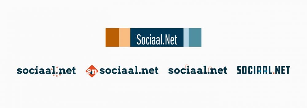
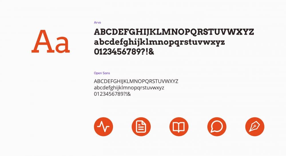
After reworking the logo, we designed a digital brand style based on simple, but expressive typography and a limited but fresh color palette.
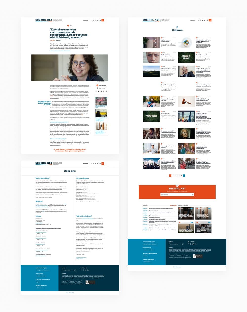
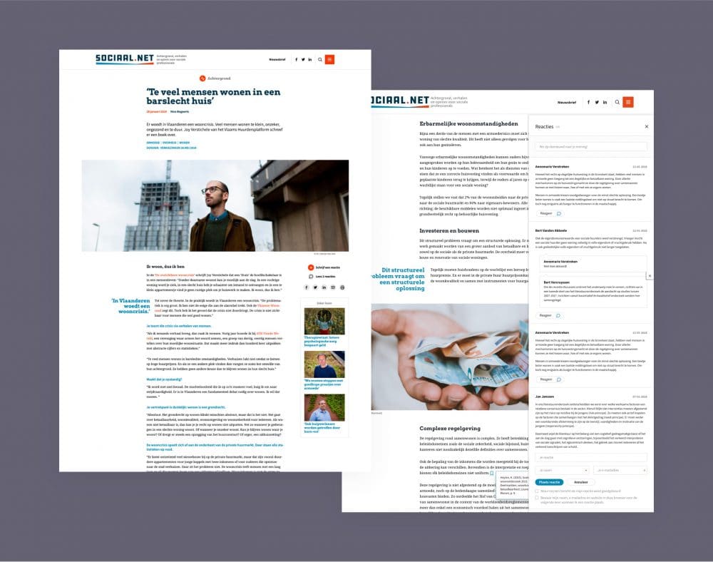
With the new logo and the digital brand style in hand, we set to work on designing new layouts for the website. All page types and components were given a new coat of paint and together with the editors and the developer we built a new magazine theme.
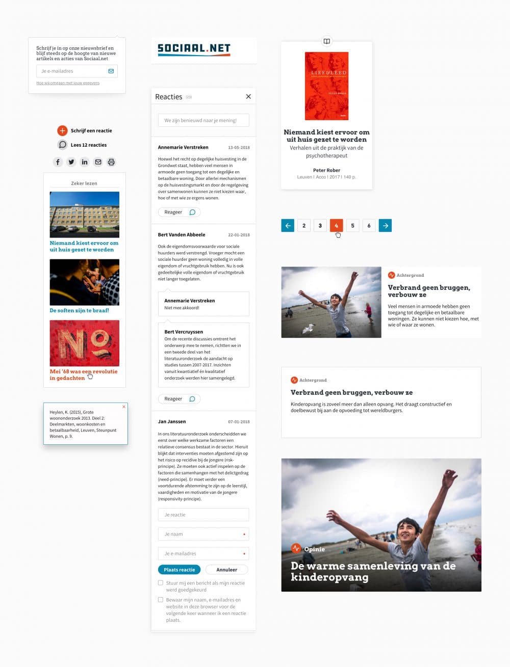
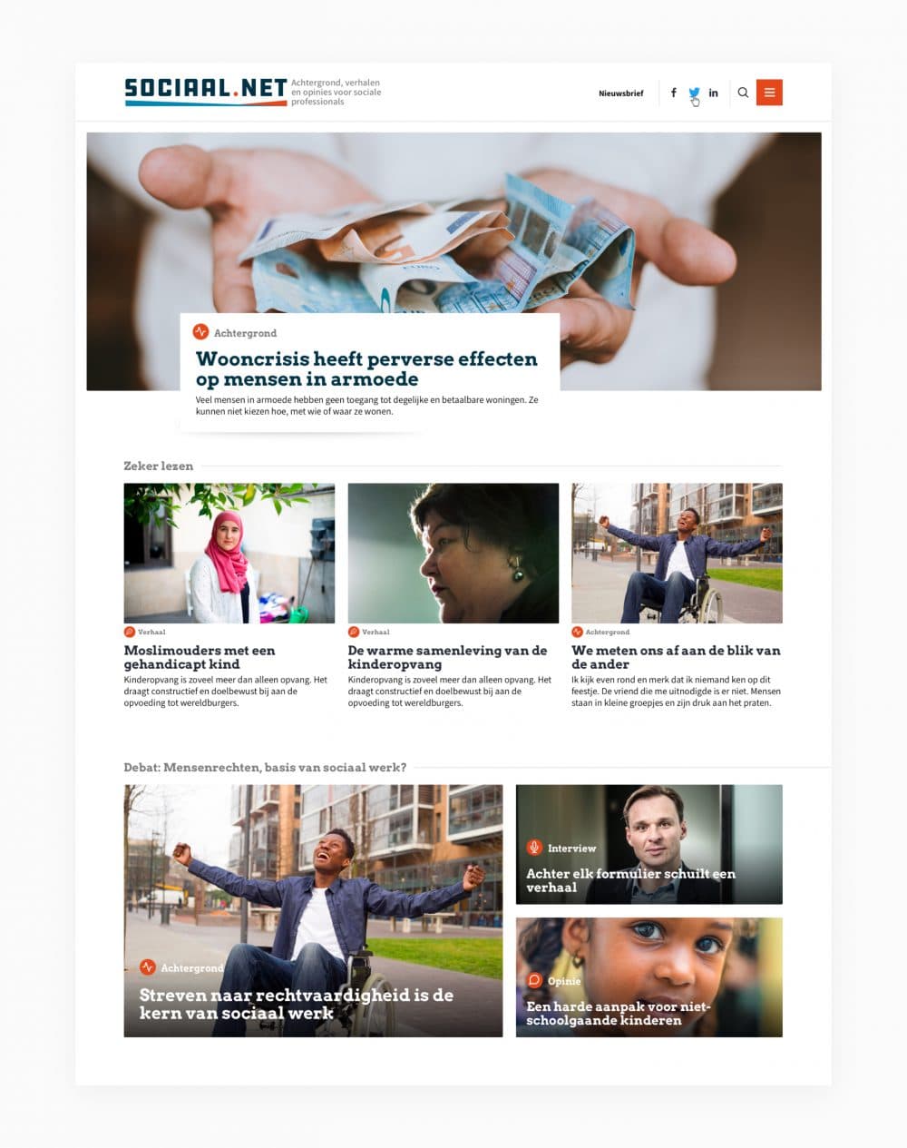
We optimized the page layout for article pages and developed a system so that visitors can leave comments quickly and easily. In this way we increased the user interaction and involvement. The search function was also updated to provide clear and more relevant search results.
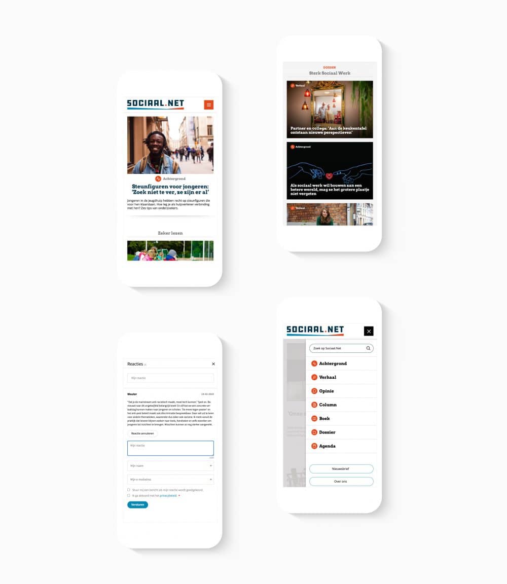
Because half of all website traffic happens on mobile devices, we paid extra attention to an optimal layout for these screen sizes.
