Mijn Mooie Straat
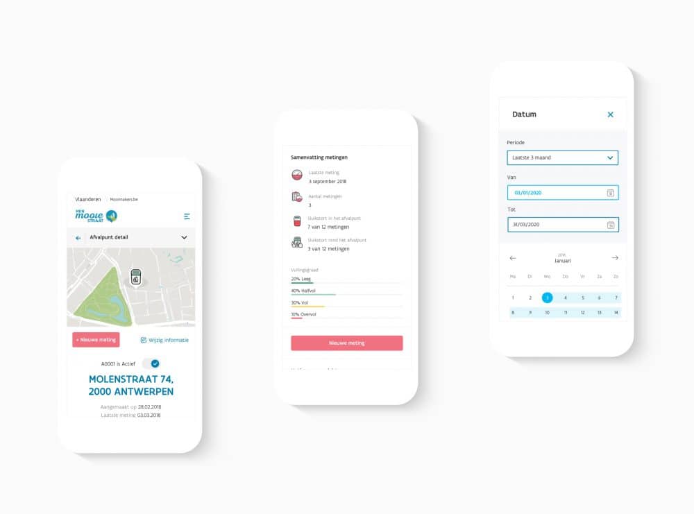
Mijn Mooie Straat (tr. My Beautiful Street) is an initiative of MooiMakers (OVAM, FOS+ and the Flemish cities and municipalities) for the centralization and optimization of processes related to the management and analysis of the garbage bin inventory of local authorities. That’s quite a mouthful, but what it comes down to is that Mijn Mooie Straat is a web application where local authorities can inventorize the garbage bins in their area, register measurements on those garbage bins and perform analyzes on all that data to gain more insight into the use of their garbage bin park, and can deal with any problems related to illegal dumping and littering. In that way Mooimakers supports local authorities in their fight against litter and illegal dumping and it makes it easier for those local authorities to report dumping and littering to the correct services or instances.
Client
Studio Lastpak
Timing
- 2019-2021
Credits
Sylvia Bosteels
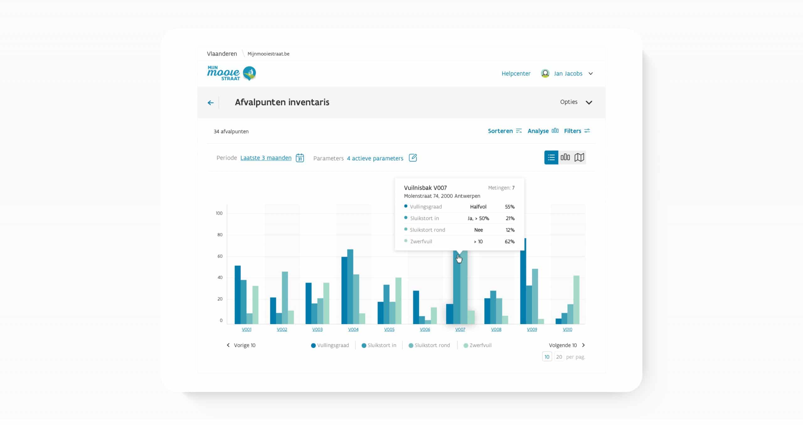
We have been working on this project with Studio Lastpak since 2019, creating designs for all pages, components and additions to the application. We always start from a thorough analysis, asking our users for input before creating all the wireframes and high fidelity mockups that are sent in turn to the development team.
Daarnaast onderhouden we ook de digitale stijlgids voor Mijn Mooie Straat en alle bijhorende applicaties (zo is er bijvoorbeeld ook een native app en natuurlijk de Mooimakers-site zelf). Op deze manier blijven al die verschillende kanalen consistent in typografie, kleurgebruik, layout en (her)gebruik van componenten.
Style library and DSM
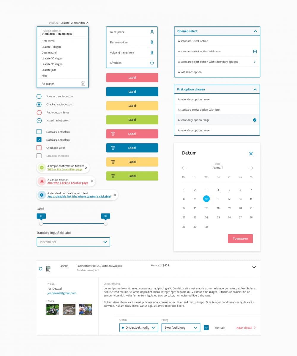
Because Mijn Mooie Straat is a large and complex application, we designed an extensive library of components and styles.
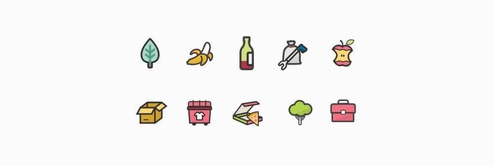
This library is maintained in a digital style guide in an InVision DSM. This way the developers always have access to the latest components and style requirements and they can easily download the necessary ‘assets’ (eg icons and images, etc.).
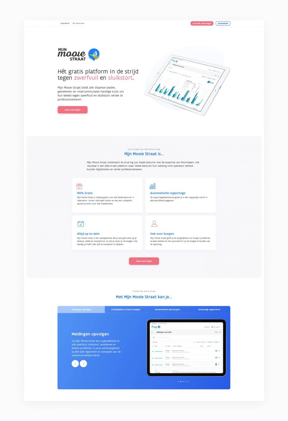
To convince local authorities of the advantages of using My Beautiful Street, we designed & developed a new, fresh product page where all functionalities and modules are listed and local authorities have the option to request a demo of the application.
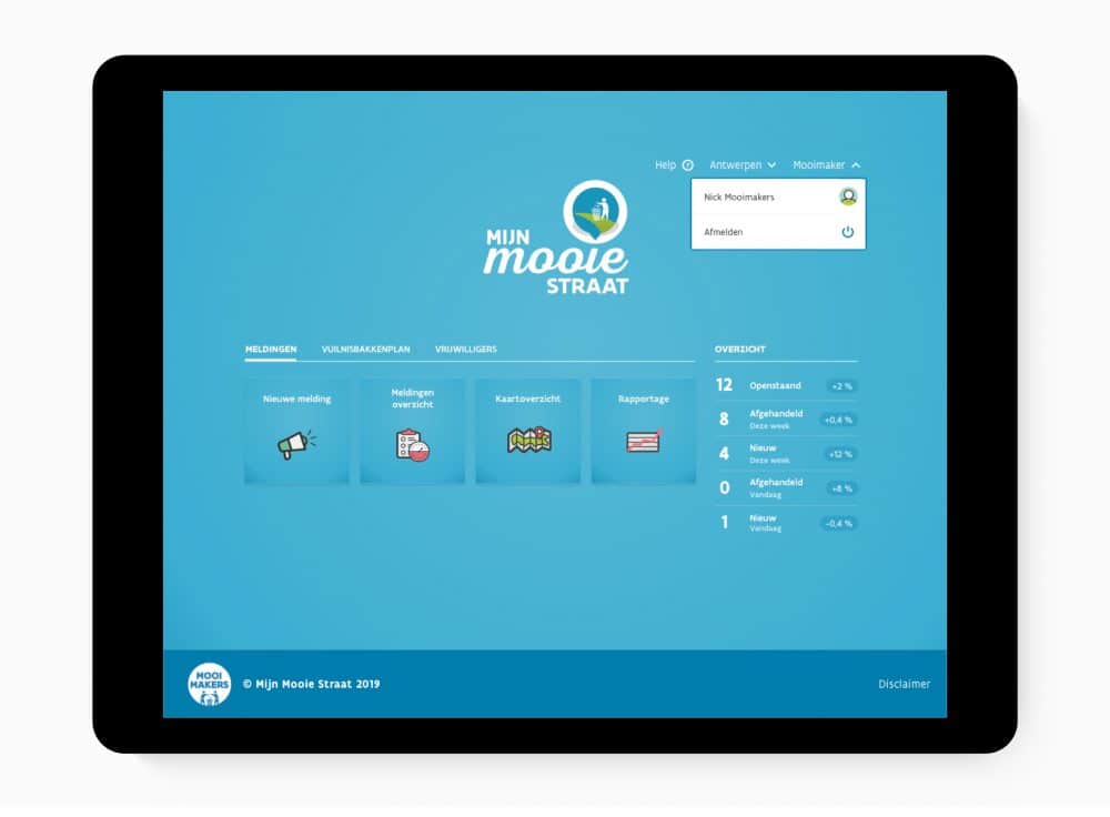
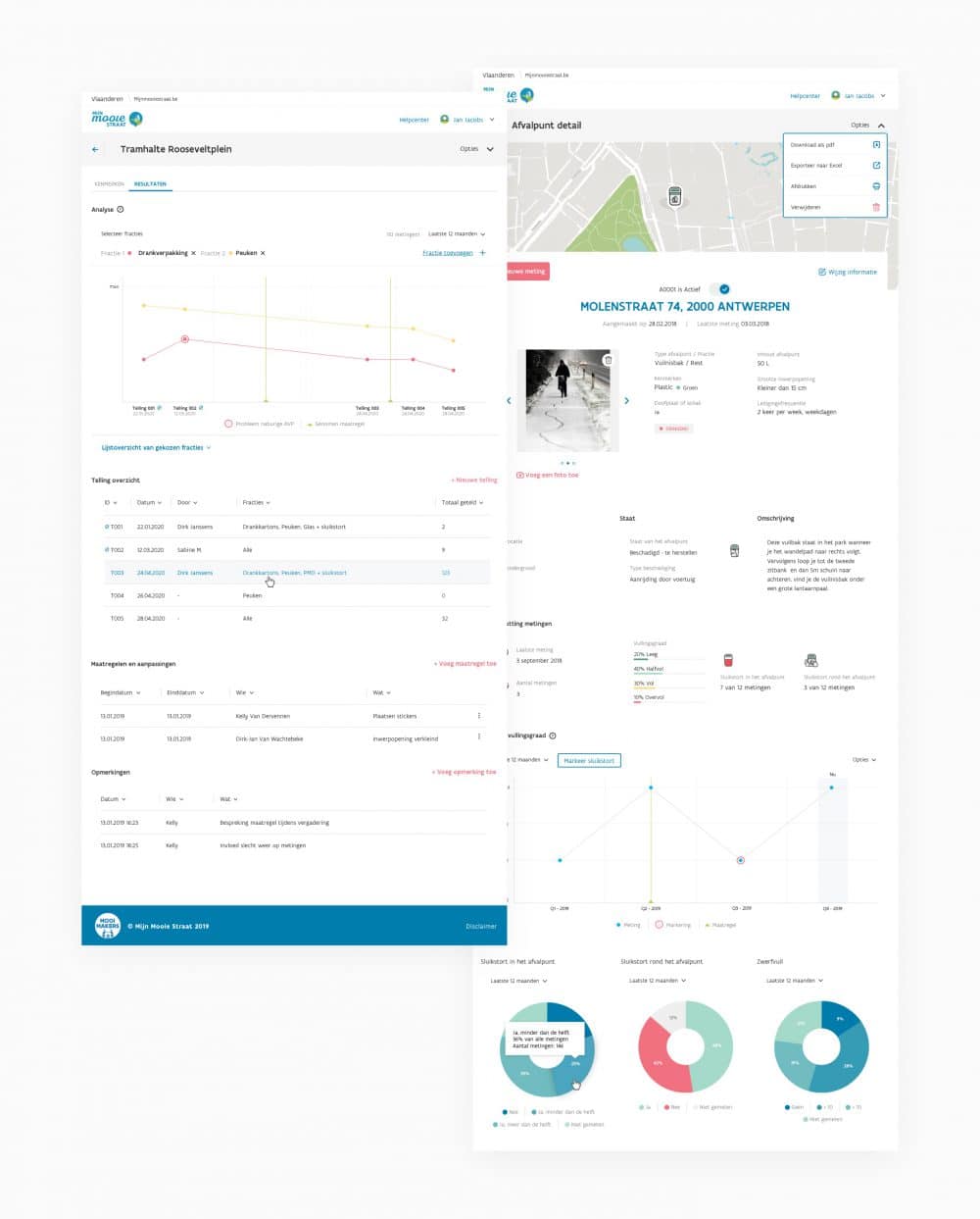
My Beautiful Street offers local authorities tools to inventory their garbage cans, they can enter measurements were made on that inventory and based on all that data, an extensive report and analysis can be set up to identify problem zones.
These type of operations require complex user actions. Moreover, My Beautiful Street is used by very different user types (eg. administrative employees, technicians in the field, etc.).
That is why we take great care to make all screens and components user-friendly. We also use a lot of colors and icons in the designs to make the application not only user-friendly, but also a pleasure to use; because nobody wants to spend their days working with an overly complicated, gray and drab application.
Another method to make the application more user-friendly is to isolate and divide processes in clear steps. We do this on the one hand by using ‘modals’ (a window within a window); these take users out of their current screen, isolating only the relevant information so they can focus on the tasks at hand. On the other hand, we divide complex processes into manageable steps; in this way we avoid confusion and overly complicated actions and forms.
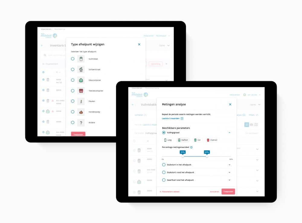
When users start an elaborate process, eg. entering a new garbage bin or a measurement, we lead them to a so called ‘Focus Layout’ where we remove all distractions so that the users can fully focus on the process at hand.
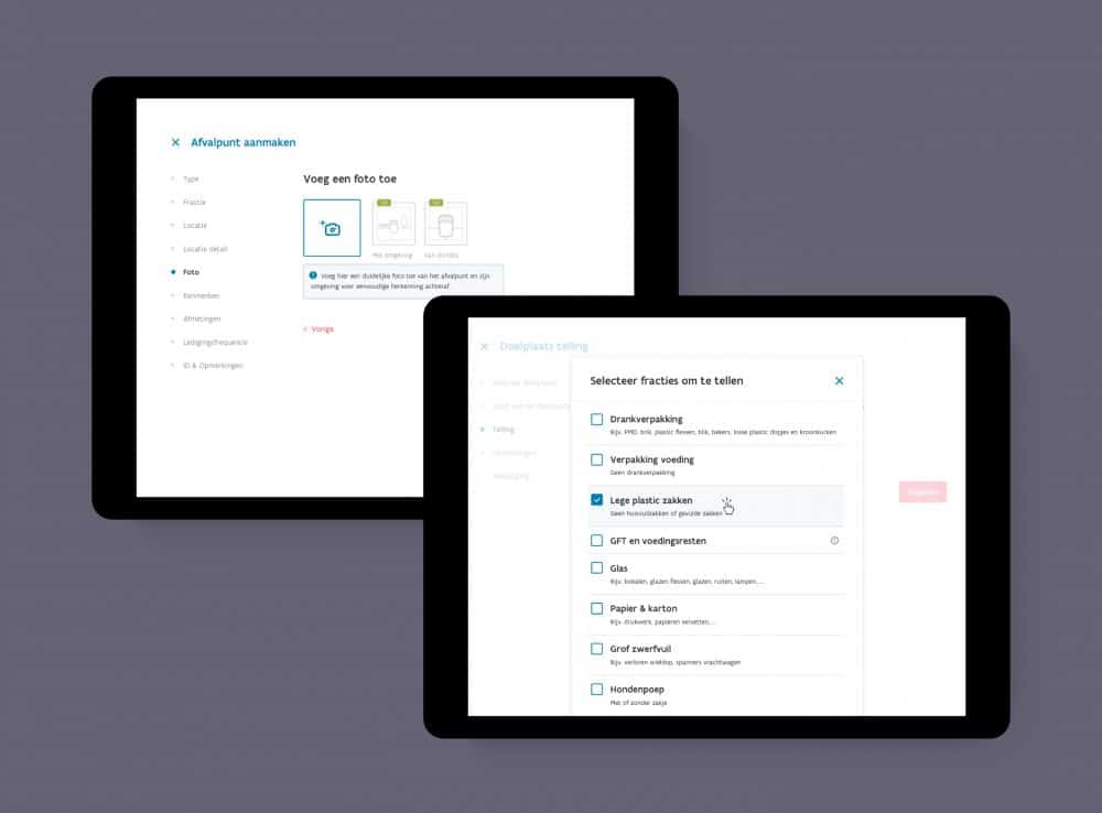

Because Mijn Mooie Straat is often used on site – eg. technicians who take measurements on the inventoried garbage cans – all screens were designed for optimal use on all current screen sizes and devices.
