ECC Belgium
Are you having problems with a purchase made in another European Member State? Are you unable to return your product and get a refund? Then the European Consumer Center (ECC) can help you with free legal advice and mediation; because your rights as a consumer do not stop at the border.
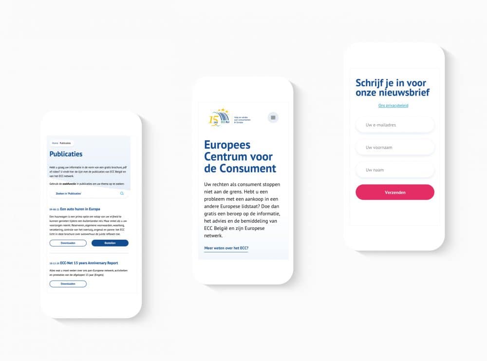
The ECC asked us to update their existing website and digital corporate identity. The ECC website contains a lot of documents, useful guides and publications; but as often happens, users found it difficult to navigate through all that content. Our mission was therefore to simplify navigation through the site and to increase the readability of the content.
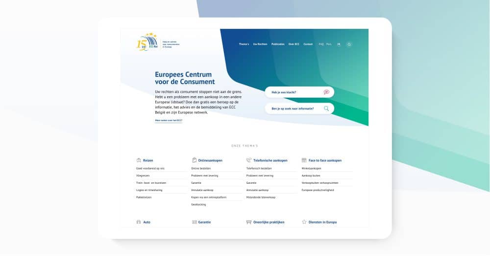
We started with a preliminary investigation. What exactly are visitors to the ECC looking for: is it information or to submit a complaint as quickly as possible? Can visitors be classified according to those intentions? And how can we direct them to the right information as quickly as possible?
Together with the ECC, we found for answers to those questions and drew up a plan to rearrange the information pages, the search functionality and the homepage. All Information displayed was prioritized and poured into wireframes, which were tested against a brief user survey.
Digital style guide
The next step was to draw up an adapted digital brand guide – we opted for a light and fresh design that would bring tranquility to the layout and make the information displayed a lot more readable.
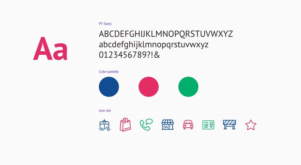
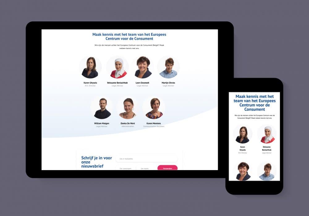
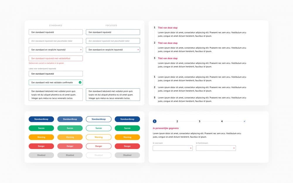
This branding was consolidated in a style guide that enables the developers to build pages and components without having to call on our designer every time. The brand guide includes designs for all main components and site elements and example layouts for the different page types.
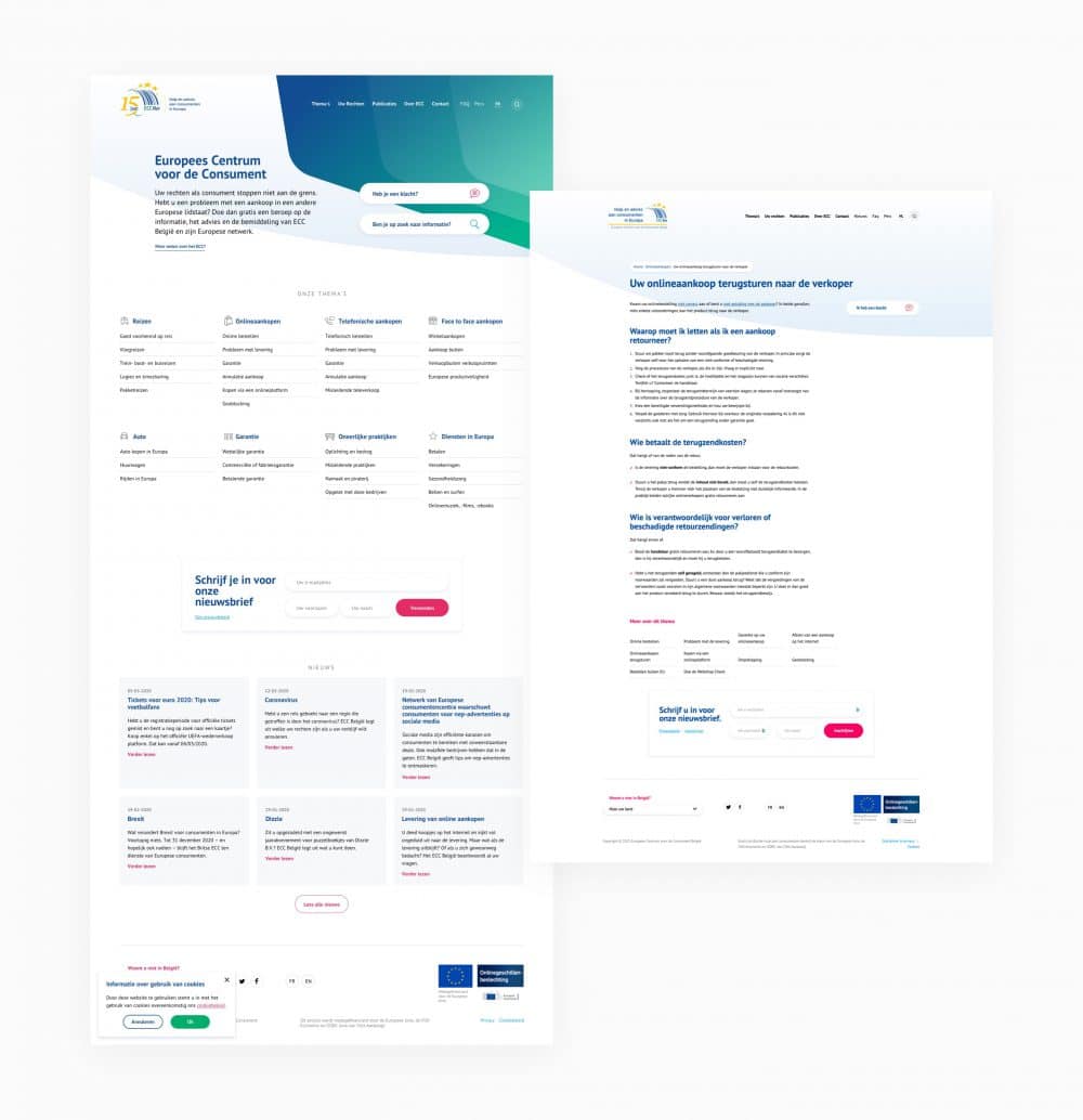
Since a large part of the traffic to the ECC website is done through mobile devices, all designs were delivered for different screen sizes. In this way we ensure optimum ease of use for all current screen sizes.
