Antwerpen.be
The site of the city of Antwerp had existed for quite some time, but was not built according to the cities brand guidelines. After a rework and refining of the these guidelines and the creation of a custom typeface for the city, it was decided to give the site a new design overhaul as well.
To this end were asked to develop a new design and an online style guide.
Our main objective was to make navigation through the site as transparent and easy as possible. So, Together with the UX team we created a global structure in which all sections and components were fitted.
We then created mockups and high fidelity designs for all the main page types and components; where each component was assigned a specific brand color (eg city map, news, events).
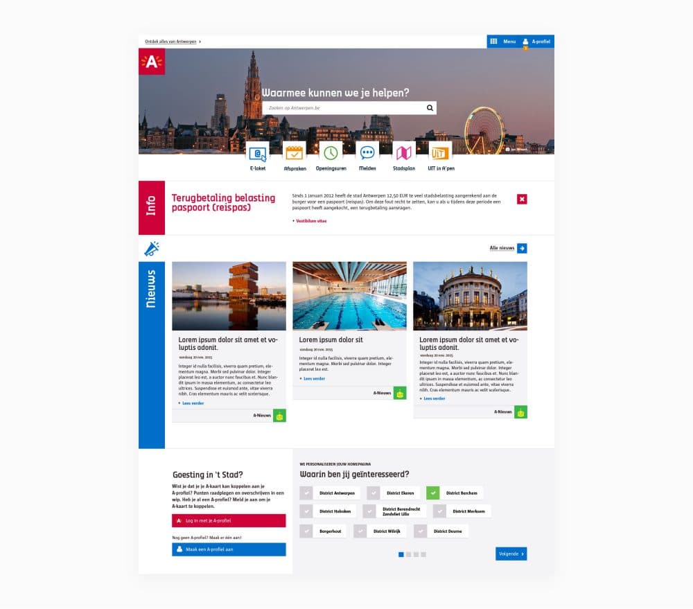
Together with the city’s corporate identity department, we developed a digital style guide for typography and color use and created a set of icons for the main sections of the site and a secondary set for smaller site components and functions.
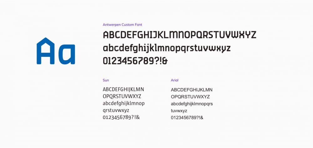
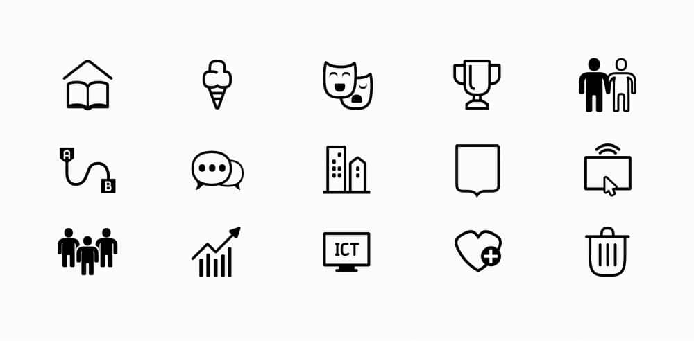
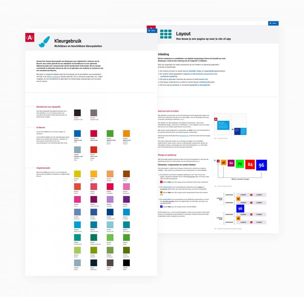
To ensure the consistency of the new style across the website and all its subsites, we consolidated all the rules and recommendations in a digital style guide, divided into chapters on color use, typography, layout, forms, animations, etc…
This guide was made available to all internal and external development teams and was also used to onboard new developers.
All those design rules were also consolidated into a series of stylsheets and html and javascript components, which were then merged into a Bower component for easy integration into existing and new projects.
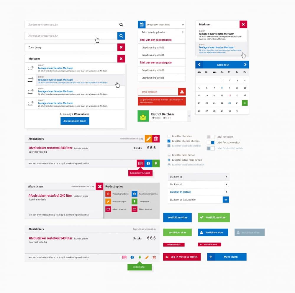
The website does not just consist of informative pages but also an extensive library of forms, for this we developed a system to simplify form input and to offer them to the user ion a stepped fashion.
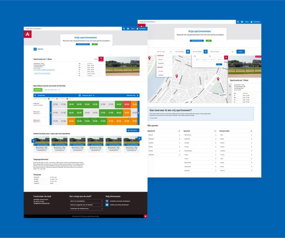
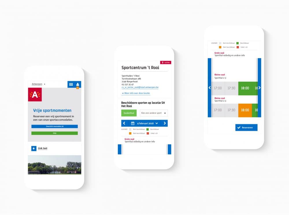
For example, for reserving sports facilities, we made a custom reservation system with a clear and user-friendly interface.
