The Floor is Yours
Life’s too short for bad presentations. Anyone who has ever had to watch a seemingly endless PowerPoint presentation in a conference room knows this all too well.
That is why The Floor is Yours offers training, courses, events and publications to teach scientists and other professionals to communicate better and more clearly. In recent years they have trained thousands of researchers and professionals in Europe and beyond.
Hans and Toon asked us to develop them a new website to present their training and activities to the public and to refine their digital design language.
Client
The Floor is Yours
Our services
Timing
- 2020
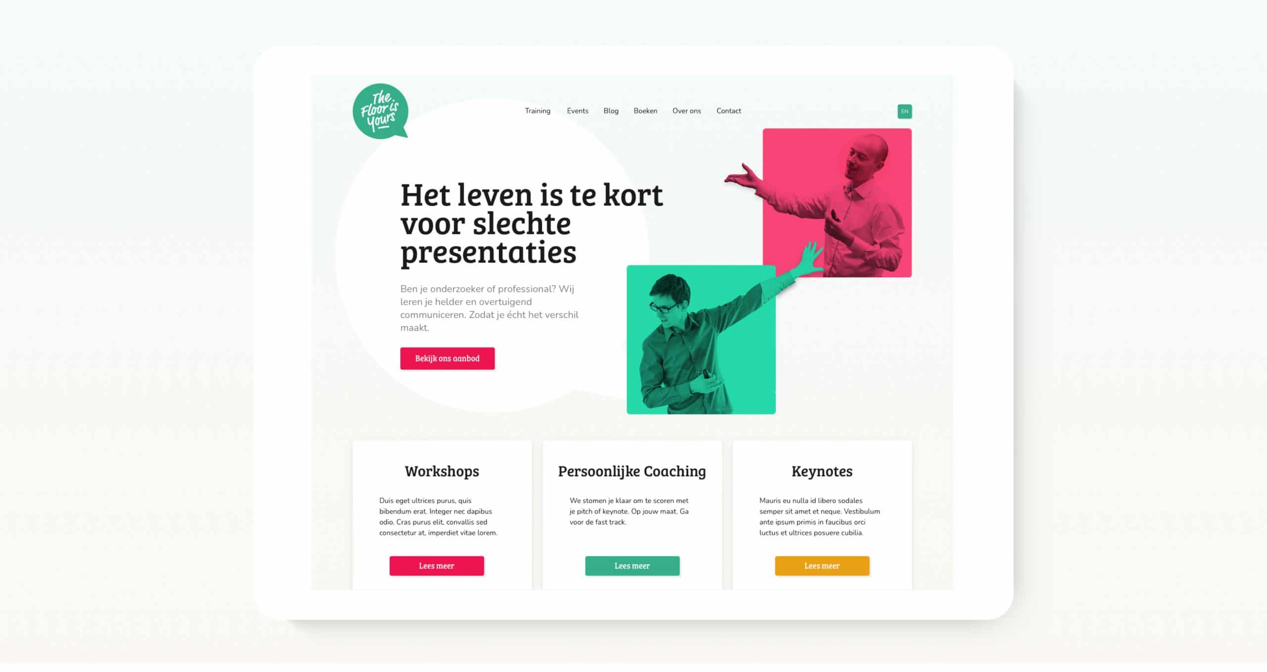
Digital corporate identity
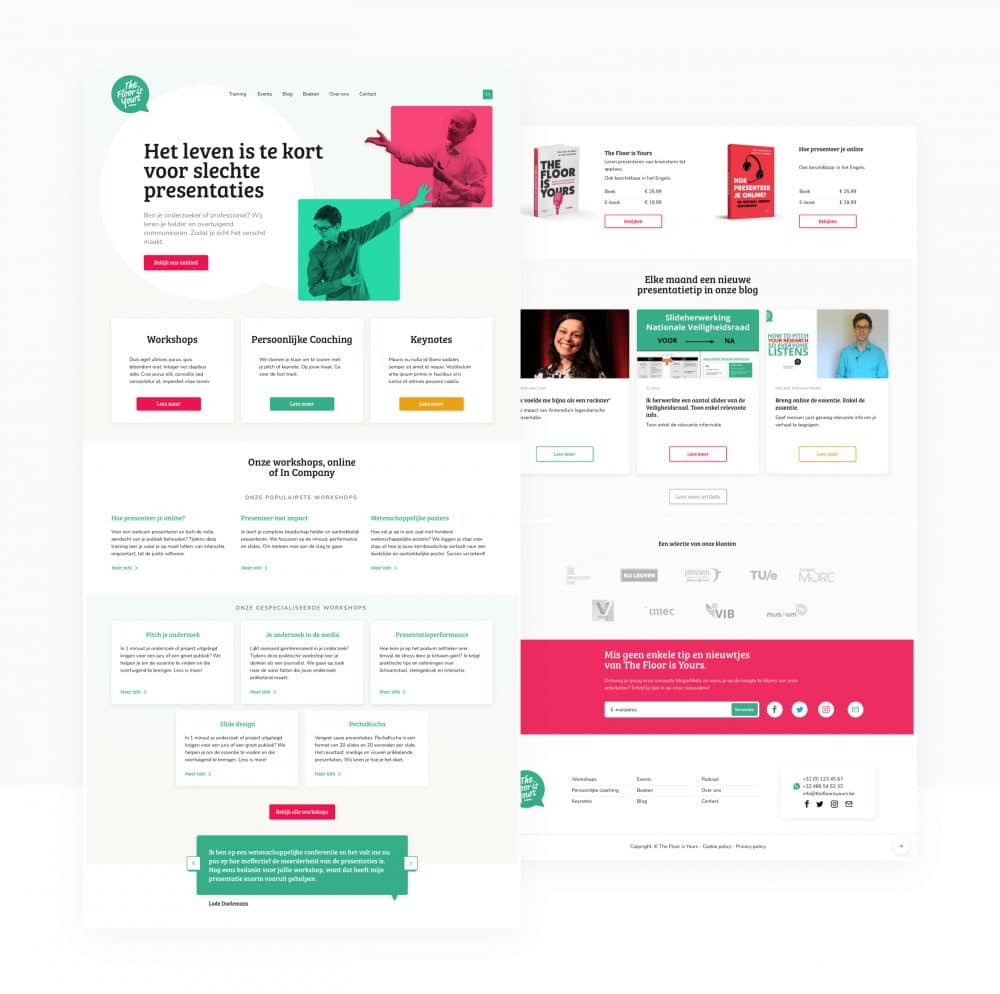
The Floor is Yours website shows information about workshops, training courses, publications, a blog and much more… That’s a lot of content to communicate clearly. That is why we opted for a friendly, colorful and above all clear and distinct style.
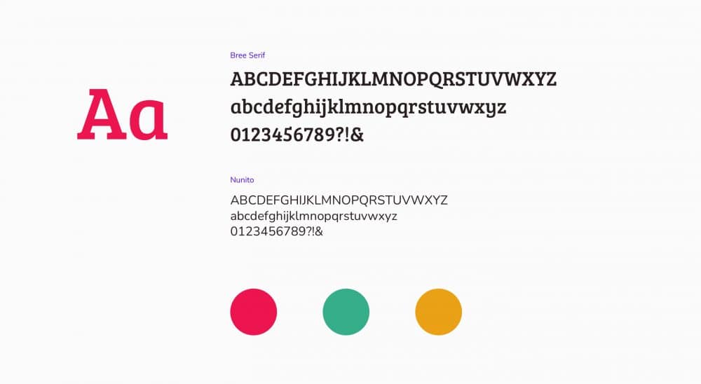
This style was recorded in a digital style guide to ensure a consistent and recognizable style throughout the website; this is indispensable to increase the users trust and it also makes using the website a lot more pleasant.
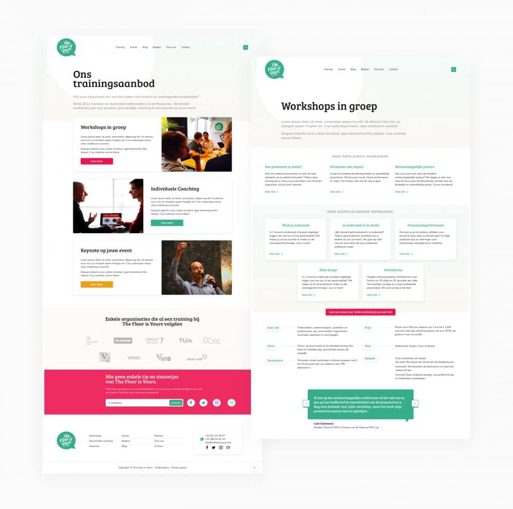
The website is a custom WordPress site that has been expanded with additional elements that allow the content managers to create interesting and diverse page layouts. In that way, we offer The Floor is Yours employees a handy, user-friendly and fast tool to present their content without always having to rely on a web developer.
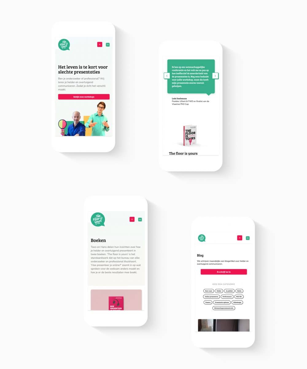
As we always do, the website has also been developed to work flawlessly on all mobile devices. This is indispensable since half of all website traffic goes through mobile devices.
